Skip to content
Company logoCompany icon
Pricing
Log inBook a demo
HomeResourcesPRODUCT DEMONSTRATIONS
PRODUCT DEMONSTRATIONS

See DataNova at work.

Start with spreadsheet uploads and the AI analyst. Then explore planning, forecasts and the business applications you can prepare with our team.

Start a 30 day trialExplore the applications
The standard platform is available after signup. Prepared business applications follow an assisted trial route.
AVAILABLE AFTER SIGNUP

Start with your own data.

Two walkthroughs of the standard platform: upload your spreadsheets and explore your data with the AI analyst.

Spreadsheet upload & reporting

Upload your workbook, choose the data to process and follow it into reporting.

Read the transcript (automatic)

Before a spreadsheet is ready for reporting, there's usually a fair bit of work to do, and that's the challenge we see all the time. Checking the files. Correcting errors. Making sure the latest figures don't overwrite the history you still need. Let me show you how we bring that process together, from uploading a workbook to exploring the results in a report. Here, we're uploading one Excel workbook containing five datasets, US sales, UK sales, EU sales, budget, and forecast. Every worksheet is detected automatically, and we can choose exactly what to process. We'll take all five. As the upload runs, the files are validated, scanned for security, checked for duplicate records, and standardized before the data goes any further. And this is where it gets more interesting. The platform analyzes the columns, data types, and schema of each sheet, then checks whether a structurally similar table already exists. If it finds a match, we can append the new records to the existing dataset. That's particularly useful for recurring data like budgets and forecasts. Instead of overwriting the previous version, each revision can be retained historically and compared against earlier budgets, forecasts, and actuals. For this demonstration, we'll create new datasets and let the pipeline continue. The ETL now runs automatically : Validation and Cleaning, Metadata Extraction, Parquet Conversion, Lakehouse Update, Semantic Model Refresh, and Power BI Refresh. What started as a spreadsheet is now structured, reusable data. Once the data is available, a Power BI report can be created automatically, giving users an immediate starting point for analysis. What we're showing next is a separate, more developed report example. It's an interactive reporting environment designed to run meetings, moving from executive KPIs into regions, products, locations, budgets, forecasts, and transaction-level detail. But spreadsheets are only one part of the picture. We can combine them with CRM, Finance, ERP, and Operational systems, bringing everything into one connected data platform. So you can follow a lead from the CRM, through the sale, into the general ledger, and ultimately to the cash received in the bank, with one joined-up view of the entire journey. The result is one governed source of truth across the business, ready for reporting, forecasting, and AI-powered analysis. If any of this looks familiar, and you'd like to see what DataNova could do with your data, get in touch.

Standard platform workflow. Demonstration figures are examples.

AI conversational analyst

Ask a business question in plain English, inspect the answer and follow up in the same conversation.

What this video covers

The on-screen walkthrough shows the AI analyst inside DataNova. It asks about gross profit and average selling price by region, the customer generating the most revenue, monthly revenue changes and why gross profit can fall while revenue rises. Answers appear with result tables that the user can inspect before asking follow-up questions. The figures are demonstration data. This written walkthrough describes the visual sequence; it is not a speech transcript.

Standard platform workflow. Demonstration figures are examples.

PREPARED WITH YOU

Explore your business application.

Planning, models and workflows for your team. Assisted trials begin after onboarding and environment setup.

FP&A: from performance to a plan

Follow a performance gap into budgeting, rolling forecasts, workforce costs, cash planning and approval workflows.

Read the transcript (automatic)

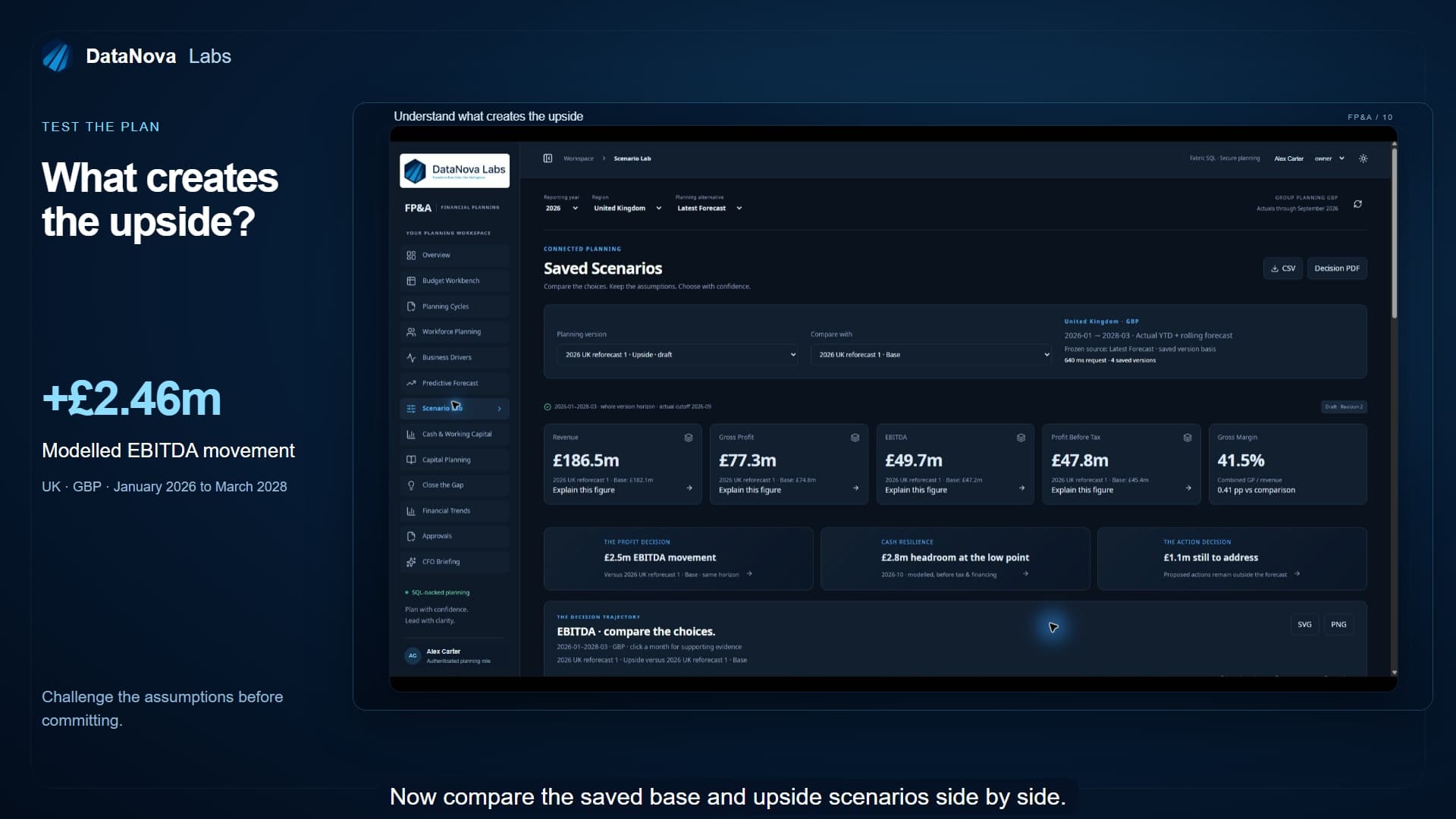
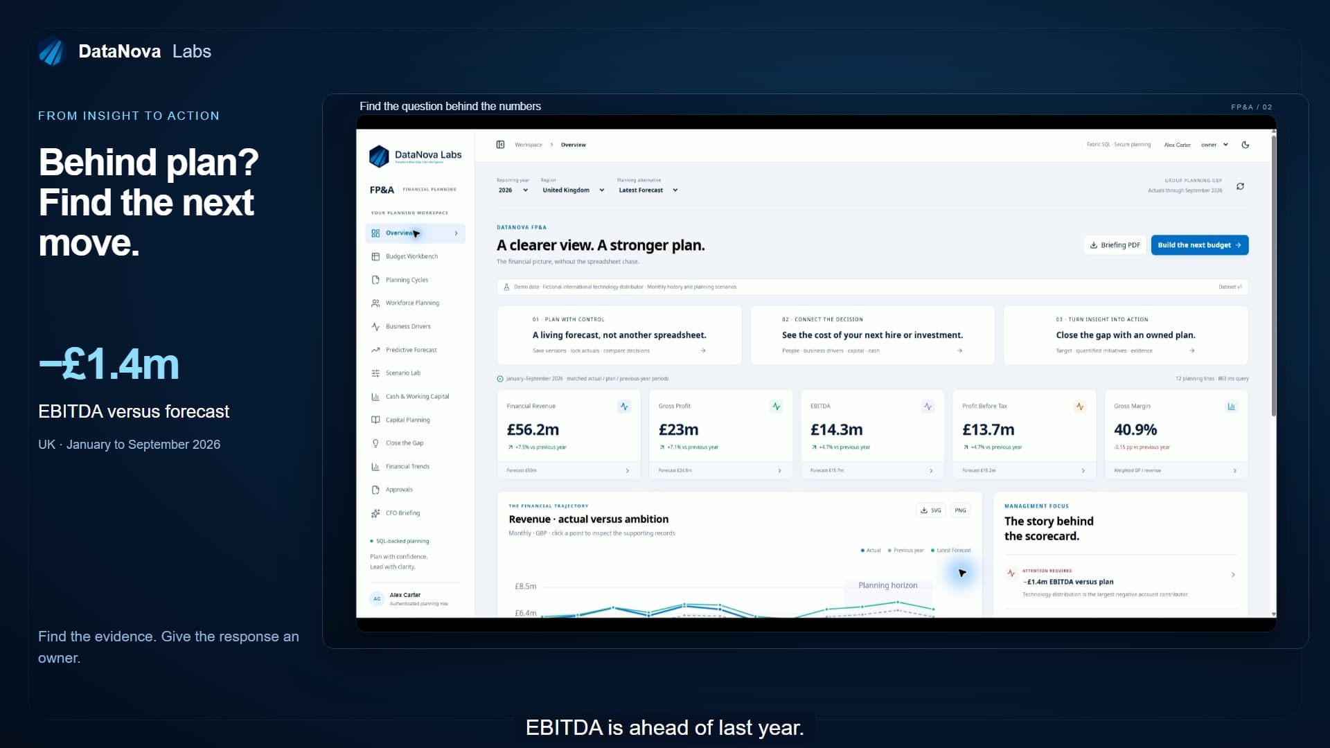
Your revenue is growing. So why are you still behind plan? And when leadership asks what to do next, how quickly can your team answer? DataNova FP&A brings performance, planning, and decisions into one workspace. Let's follow the numbers, test the options, and turn the conversation into a plan. Here, we're looking at UK performance through September, comparing actual results with the latest forecast and the previous year. Revenue is growing. EBITDA is ahead of last year, but it's still around 1.4 million pounds below forecast. So what's driving the gap? Click the EBITDA figure to see the accounts behind it. Which contributions helped? Which held performance back? And how do they reconcile to the headline number? Open the supporting monthly records, investigate the movement, then return with the original reporting context intact. Finance and operational leaders can explore the same evidence together without asking someone to rebuild the analysis for every follow-up question. The dashboard becomes the start of the discussion with a clear route from the headline to the detail. Now let's change the plan. The budget workbench feels familiar, like a spreadsheet, with a shared SQL database behind it. Here, January's technology budget becomes 90,000 pounds. Monthly and line totals recalculate, and the change is saved. Switch between monthly, quarterly, and annual views. Configure up to 20 descriptive columns around your departments, cost centers, and planning needs. Approved lines stay locked, so teams can develop the draft without changing the figures already agreed. What happens when the business changes halfway through the year? Keep the original budget, create a reforecast, and save alternative scenarios without overriding your starting point. This version combines actual results through September with 18 future months, taking the planning horizon to March 2028. Actual months stay locked. Future months remain open for planning. Clone a version, give it a name, adjust the assumptions, and compare the result. Each saved version keeps its own basis, giving the team a consistent reference for the next decision. Start with people. Model a proposed hire using salary, full-time equivalent, start date, employer costs, and bonus. Here, a commercial planning analyst adds approximately 120,000 pounds across the selected horizon. The proposal sits alongside the existing people-cost baseline, so its additional financial impact is visible before anyone commits. Then test the assumptions behind growth. What if prices increase? What if volumes improve? And what if supplier costs rise at the same time? Driver-based planning translates those assumptions into financial outcomes, so commercial and finance teams can discuss the decisions behind the numbers. Planning an investment? This warehouse automation proposal separates the upfront cash commitment from depreciation, making both the cash cost and the impact on profit visible. And can the business fund the plan? Test collection days, supplier payments, and inventory assumptions against projected cash and headroom before tax and financing. The same workspace is available in light and dark mode. Now compare the saved base and upside scenarios side by side. Across this planning horizon, the upside produces approximately 2.46 million pounds more modeled EBITDA. The important question is what creates that difference? The account bridge shows the contributions, including the additional cost of the proposed hire. Leadership can challenge the assumptions and assess the trade-offs together. It's a modeled opportunity, not a promised result. A clearer basis for deciding what to do next. Click a month on the chart to inspect the evidence behind the scenario. The selected version, period, and comparison stay with the analysis so the discussion can move into detail and back again without losing its place. Financial trends brings actual performance, the previous year and the selected planning alternative together. The reporting cutoff makes the boundary between actual results and future plans clear. Use the charts to explain the story, investigate an unexpected movement, or take a visual into the next management presentation. What does the historical pattern suggest, independently of management's assumptions? Predictive Forecast adds a machine learning outlook tested against past results and a seasonal baseline. Review its coverage and measured error alongside the business plan. It's another perspective to evaluate, with your team keeping control of the decision. The CFO briefing turns calculated evidence into a focused executive discussion. AI-generated commentary groups the findings into attention required, positive performance, and monitor, with supporting figures and links to the evidence. Leaders can see what deserves attention, then investigate further. The commentary supports judgment. It doesn't approve changes, and explanations still need to be checked against the evidence. You've identified the gap. Who owns the response? Close the gap connects the target to specific initiatives, accountable owners, and proposed financial impact. Here, a logistics initiative addresses 180,000 pounds. The remaining gap stays visible, and proposed benefits remain separate from results already achieved. When it's time to share the decision, the reporting context travels with it. Export the selected scenario to CSV, produce a Decision Pack PDF, or download a chart for a presentation. Take the same version into a leadership meeting, a detailed spreadsheet review, or a wider planning discussion. The selected periods and scenario remain clear to the next reader. A plan also needs a clear route to agreement. Configure sequential approval stages around the relevant planning roles, with controlled access and an audit trail. Submitted work is locked during review. Submitters can't approve their own submissions. Here, we're viewing an existing approved version. Its figures are frozen, and the history records the decisions behind it. To explore another change, clone it into a new draft. Teams have room to iterate while preserving the version leadership actually approved. You don't have to connect every system to get started. Use FP&A as a standalone workspace, uploading files or entering data directly. Start with a ready-to-use foundation, then configure the planning structure, terminology, and approval routes around your organization. And where your process needs more, we can tailor the workflows with you. When you need the wider picture, connect your business data directly into FP&A. Bring ERP, CRM, finance, and operational data alongside your plans for a fuller view. Connections and mappings are configured for your environment. You can also publish agreed planning data sets into a Fabric lakehouse, ready for your reporting, analytics, and other applications to use. Start standalone or build it into your connected data platform. What would your team do with more time to plan and less time assembling the picture? See DataNova FP&A with your own business scenarios. Book a tailored demo at datanovalabs.com. Plan with confidence. Lead with clarity.

Full walkthrough: 8:34. Illustrative data and modelled scenarios. Application scope and setup are agreed with our team.

Aurelia: a business application in action

Explore reporting, financial evidence, custom models and email briefings in one connected business application.

Read the transcript (automatic)

Every business has reports. The opportunity is to connect them to the decisions people need to make. At DataNova, we develop bespoke data, reporting, and intelligence platforms around your business. Aurelia is a working example using demonstration data. We will follow a question from the executive dashboard through financial evidence and custom machine learning to a briefing delivered by email. Revenue is $165.9 million, up 3.9%. That is a positive result. But gross profit has slipped. Gross margin is down more than one percentage point and revenue is below budget. More sales are coming through, but less of each sales dollar is becoming gross profit. That gives leadership a clear question. Where is the pressure and what deserves attention first? The supporting reports let us explore the question across sales, customers, products, purchasing, and operations. We can compare periods and investigate the available business dimensions. This is the value of a connected reporting application. The headline provides direction, and the supporting detail helps the team decide where to investigate. Finance reporting brings together profit and loss, the balance sheet, and the supporting ledger. The period, currency, and reporting scope stay visible so the team can understand what the figures represent before moving into the analyst's explanation. The financial views give leadership a common point of reference for the meeting. A movement can be discussed in the context of the statement, then followed into its supporting detail. The scope stays part of the conversation. The CFO analyst brings in the financial ledger perspective, which has a different reporting basis from the commercial sales view. Financial revenue is down 15.4%. Operating expenses have reduced by 7.6%. Costs are falling, but more slowly than revenue. The analyst turns these calculated measures into findings, priorities, and questions for management. We can follow a finding into a reconciled account movement, then into the supporting ledger in journal detail. The nine account revenue bridge also shows a zero reconciliation difference. That helps the team connect the total movement to the individual accounts contributing to it. The discussion becomes more focused. Which accounts moved? How much did they contribute? And what should the responsible manager investigate? Here, the complete five-line journal has matching debit and credit totals. That gives finance a practical route from explanation to evidence. Meeting view brings the discussion together for leadership. The key movements, investigation points, and management questions are presented in a format the room can work through. We can move from reviewing performance to agreeing the next action, then return to the detail when someone needs supporting evidence. the application becomes part of the management conversation. Budget versus actual reporting shows where performance differs from plan. For client deployments, we can also develop budget submissions, revised forecasts, operational updates, approvals, and locked versions. These are bespoke workflows designed around the client's controls, connecting people contributing information with management reviewing the result. Decision Studio takes us into the separate Atlas demonstration business shown in pounds. Now the question changes. What might happen next? What options do we have? And how should we prepare? The demand forecast uses a custom gradient-boosted machine learning model tested against a seasonal benchmark. 13 historical weeks were held back from training to assess performance on unseen data. At company level, weighted weekly forecast error was 3.29%, compared with 3.63% for the benchmark. Detailed product and site forecasts have greater uncertainty, so the level of the comparison matters. The future view extends the planning horizon by 12 weeks. This gives the team a tested basis for planning, with uncertainty visible alongside the forecast. We can develop models around the client's priorities, including revenue or cash forecasting, renewal risk, and scenario analysis, where the data supports them. We define the decision, test the model, and agree how its output will be used in the business. The forecast becomes more useful when we connect it to an operational choice. Under expected demand, the balanced stock policy models around 309,000 pounds of additional warehouse contribution and 1.46 million pounds of additional cash compared with the current policy. The held-out replay gives a more restrained result, around 133,000 pounds of additional contribution and 1.06 million pounds of additional cash. Under high demand stress, the balanced policy loses ground. A more resilient policy protects service better in the replay but commits substantially more cash. These are conditional scenarios. They help management weigh service, stock, and cash before choosing a policy and identify the assumptions to monitor afterwards. Manpower planning connects workload to capacity. At the baseline, the plan identifies no additional hires. At 1.75 times the workload, it identifies five hires with some early hours still uncovered. That prompts a better discussion than a headline headcount alone. Where is the gap? When does it occur? And what mix of hiring, overtime, or temporary cover should be considered? The site view makes the timing practical. Management can inspect where cover is needed and compare the staffing response before committing to a change. Pricing is another decision where the quality of the evidence matters. This experiment shows a possible improvement, but the uncertainty is too wide to establish a reliable gain. The current recommendation is to hold the rollout. A useful intelligence platform helps the team recognize both an opportunity and the point where more evidence is needed. The AI-assisted briefing brings the findings into plain language. What is positive? What needs attention? What actions to consider? And what to monitor next? In this demonstration, generated commentary is matched to the supporting data and scenario evidence. That connection matters. The insight should help someone act on the analysis and find the evidence when they need to check it. The briefing can reach the person who needs it by email. This demonstration has a weekday executive briefing configured and a test has already been received and approved. The email presents the important findings in a readable form with a route back into the application. The recipient can start with a summary and follow the detail where a decision needs more attention. For clients, this can become a morning briefing about the previous 24 hours, a weekly review of the important movements, or an alert when an agreed condition is met, margin pressure, spending beyond tolerance, or a forecast stock shortfall. The reporting period, source context, and delivery setup are visible. For a client solution, we agree how data is updated, how often analysis runs, and when people receive an update. Clear timing helps recipients understand the evidence behind each briefing. We tailor the measures, recipients, timing, and escalation rules around the business. The update should explain what changed, why it matters, whether it is positive or negative, and what to investigate or monitor next. This is proactive intelligence, bringing a focused, evidence-backed update to the people who need to make a decision. The experience can be shaped around the people using it, including clear light and dark presentation. Aurelia demonstrates what is possible. For your business, we build around your data, your processes, and your decisions, from the first input screen to the next management action.

Full walkthrough: 8:58. Illustrative data and modelled scenarios. Application scope and setup are agreed with our team.
Financial intelligence

Follow a finding into the ledger and supporting journal detail.

Read the transcript

We can follow a finding into a reconciled account movement, then into the supporting ledger and journal detail. The nine-account revenue bridge also shows a zero reconciliation difference. That helps the team connect the total movement to the individual accounts contributing to it. The discussion becomes more focused: which accounts moved, how much did they contribute, and what should the responsible manager investigate? Here, the complete five-line journal has matching debit and credit totals. That gives finance a practical route from explanation to evidence. We can move from reviewing performance to agreeing the next action, then return to the detail when someone needs supporting evidence.

Demonstration data and modelled examples, not achieved customer results.

Workforce planning

Explore the staffing response to a change in workload.

Read the transcript

Manpower planning connects workload to capacity. At the baseline, the plan identifies no additional hires. At one point seven five times the workload, it identifies five hires, with some early hours still uncovered. That prompts a better discussion than a headline headcount alone: where is the gap, when does it occur, and what mix of hiring, overtime or temporary cover should be considered? The site view makes the timing practical. Management can inspect where cover is needed and compare the staffing response before committing to a change.

Demonstration data and modelled examples, not achieved customer results.

Custom machine learning

See a demand forecast, its benchmark and the uncertainty behind the model.

Read the transcript

The demand forecast uses a custom gradient-boosted machine learning model, tested against a seasonal benchmark. Thirteen historical weeks were held back from training to assess performance on unseen data. At company level, weighted weekly forecast error was three point two nine per cent, compared with three point six three per cent for the benchmark. Detailed product and site forecasts have greater uncertainty, so the level of the comparison matters. The future view extends the planning horizon by twelve weeks. This gives the team a tested basis for planning, with uncertainty visible alongside the forecast. We define the decision, test the model and agree how its output will be used in the business.

Demonstration data and modelled examples, not achieved customer results.

Proactive email insights

Bring a focused data briefing into the working day.

Read the transcript

The AI-assisted briefing brings the findings into plain language: what is positive, what needs attention, what actions to consider, and what to monitor next. The briefing can reach the person who needs it by email. The email presents the important findings in a readable form, with a route back into the application. For clients, this can become a morning briefing about the previous twenty-four hours, a weekly review of the important movements, or an alert when an agreed condition is met: margin pressure, spending beyond tolerance, or a forecast stock shortfall. This is proactive intelligence: bringing a focused, evidence-backed update to the people who need to make a decision.

Demonstration data and modelled examples, not achieved customer results.

Stock scenario decisions

Explore a stock decision through a modelled scenario.

Read the transcript

The forecast becomes more useful when we connect it to an operational choice. Under expected demand, the balanced stock policy models around three hundred and nine thousand pounds of additional warehouse contribution and one point four six million pounds of additional cash, compared with the current policy. The held-out replay gives a more restrained result: around one hundred and thirty-three thousand pounds of additional contribution and one point zero six million pounds of additional cash. Under high-demand stress, the balanced policy loses ground. A more resilient policy protects service better in the replay, but commits substantially more cash. These are conditional scenarios. They help management weigh service, stock and cash before choosing a policy, and identify the assumptions to monitor afterwards.

Demonstration data and modelled examples, not achieved customer results.

Pricing decisions

Explore the evidence behind a commercial pricing decision.

Read the transcript

Pricing is another decision where the quality of the evidence matters. This experiment shows a possible improvement, but the uncertainty is too wide to establish a reliable gain. The current recommendation is to hold the rollout. A useful intelligence platform helps the team recognise both an opportunity and the point where more evidence is needed.

Demonstration data and modelled examples, not achieved customer results.

FOUR SHORT WORKFLOWS

Explore the part of FP&A that matters to you.

Each highlight takes less than a minute. The full walkthrough connects the planning process from start to finish.

0:41

From the performance gap to the next action

Follow an EBITDA gap into its supporting accounts, then connect the response to initiatives and accountable owners.

0:39

Compare scenarios and explain the difference

Compare a base plan with an upside scenario and inspect the account movements behind the modelled result.

0:49

A predictive forecast and an evidence-based AI briefing

Compare a machine learning outlook with the business plan, then explore an executive briefing linked to supporting figures.

0:59

Start with your files. Connect more when you are ready.

Start FP&A with uploaded files or direct entry, then connect business systems and publish agreed planning data into a Fabric lakehouse.

Watch the full 8:34 FP&A walkthrough

Bring your next reporting
or planning challenge.

Tell us what you want to improve, which systems hold the data and who needs to use it. We’ll help you identify a practical starting point.

Discuss your use case
Company logoCompany icon

Explore

AboutInsightsFAQsBook a Demo

Company

HomePlatformIntelligencePredictManaged BI ServicesSolutionsDynamics 365PricingNova AI Visual BuilderApplicationsProduct demonstrations

Legal Links

Privacy PolicyCookie PolicyTerms and Conditions

Social Links